Showcase the catalog
Put signature breads front and center with appetizing photography.
A warm, appetite-first landing page that turns browsing into orders.
View on Behance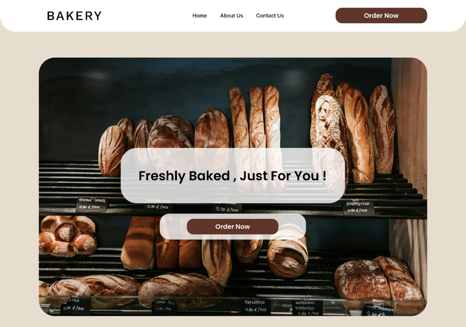
A landing page for a local bakery that showcases its products and previous work, introduces the brand and makes ordering — or simply getting in touch — effortless.
Put signature breads front and center with appetizing photography.
Show previous work and the people behind the bakery.
Clear, repeated calls to action for direct order requests.
Email, phone and social links always one scroll away.
Keep scrolling — the complete landing page moves through the browser window below, from hero to footer.
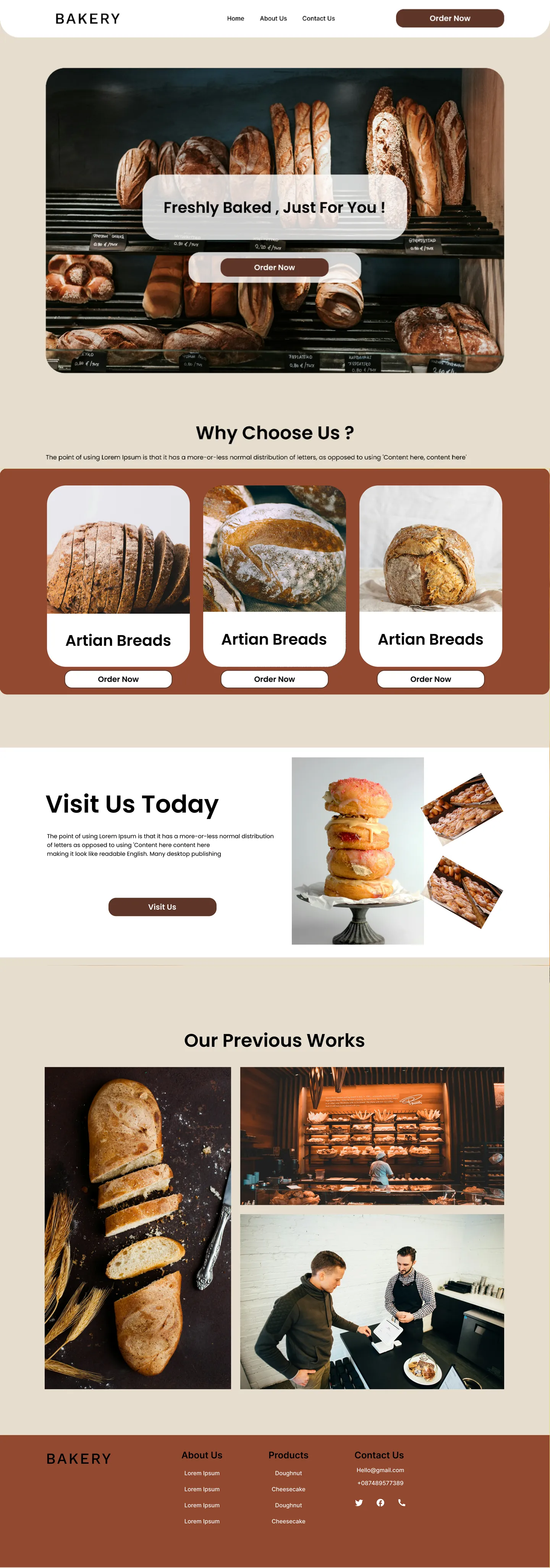
“Freshly Baked, Just For You!” sits over full-bleed photography of the bread counter, with one primary action — Order Now — echoed in the navigation bar.
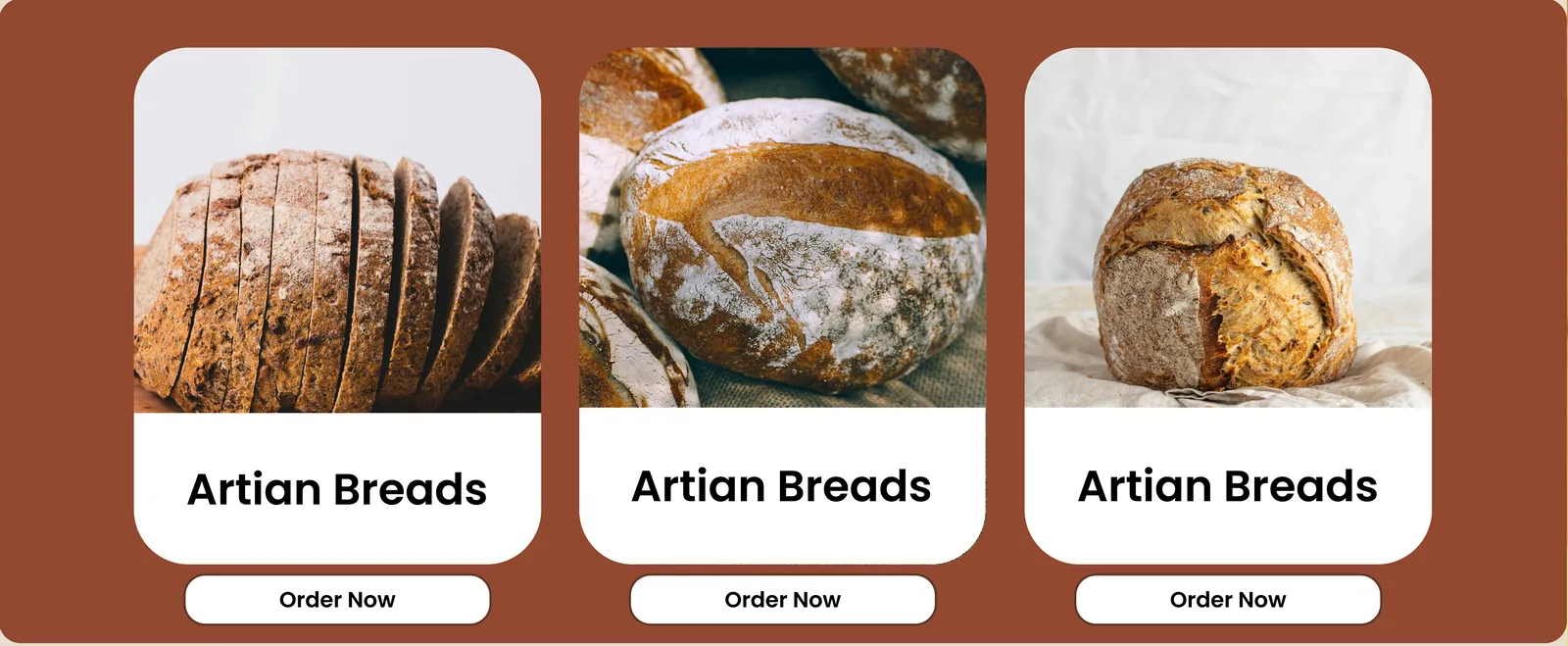
Product cards pair appetizing imagery with their own Order Now button, so visitors can act the moment something catches their eye.
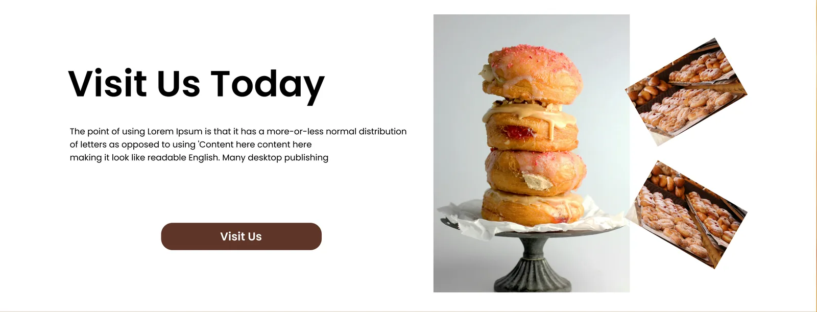
An invitation to the physical shop balances online ordering with the in-store experience.
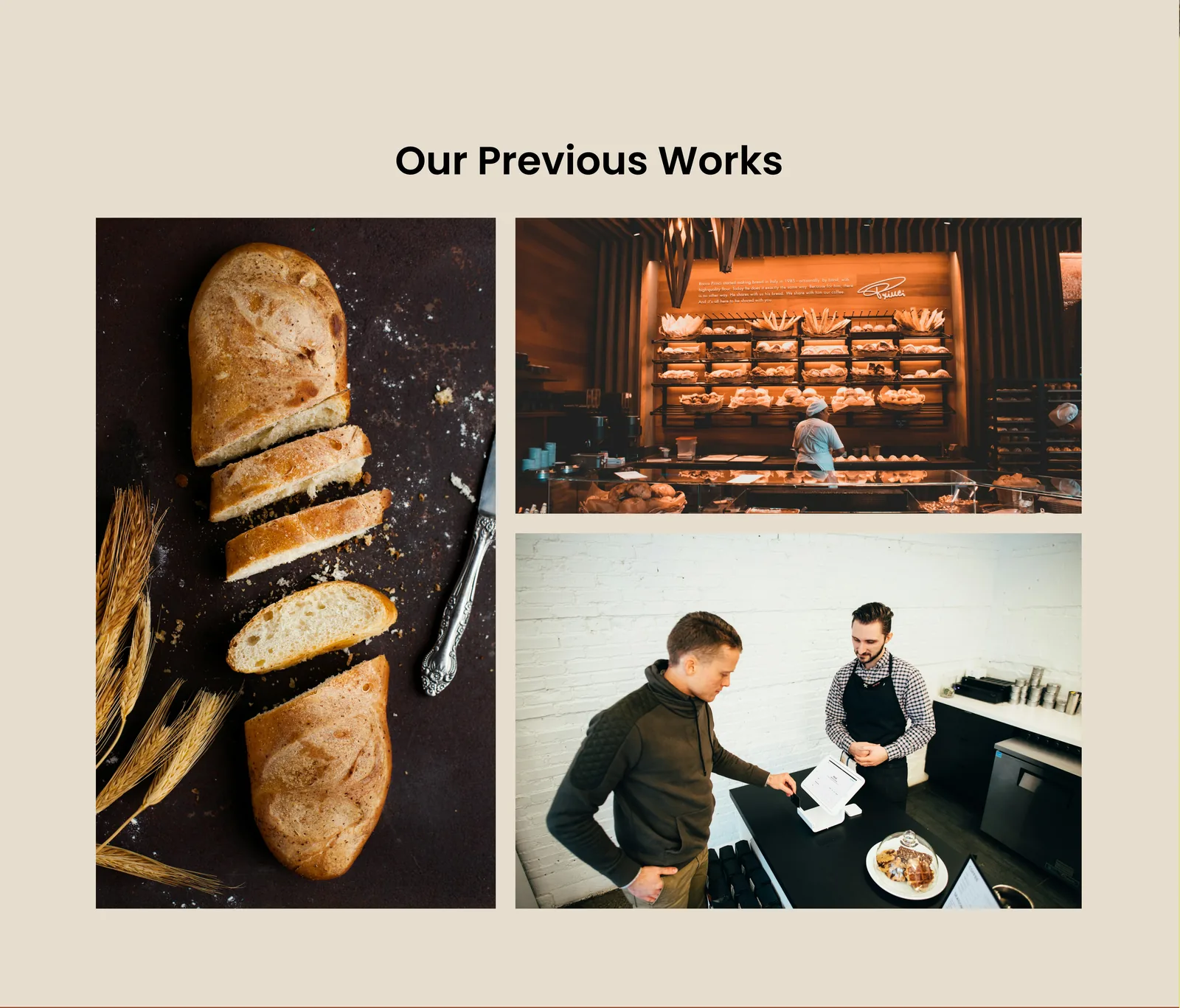
A gallery of bakes and behind-the-scenes moments adds credibility — followed by a footer with contact details, product links and social channels.
Cream, terracotta and espresso keep the focus on the food, while rounded cards and pill-shaped buttons echo the soft shapes of fresh bread. Tip: click a swatch to copy its hex.