Slow delivery, unclear quality
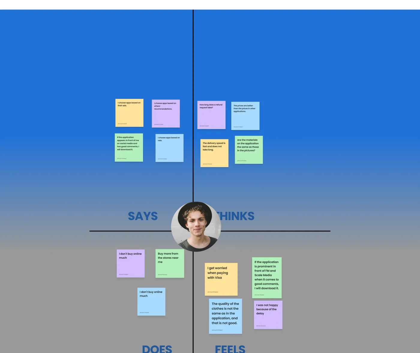
Shoppers worry about late deliveries and clothes that don’t match what they saw in the app. Categories can be confusing, and feedback rarely leads to visible improvements.
A shopping app that makes finding the perfect fit fast, clear and trustworthy.
Unofficial concept project for learning and portfolio purposes — not affiliated with or endorsed by H&M.
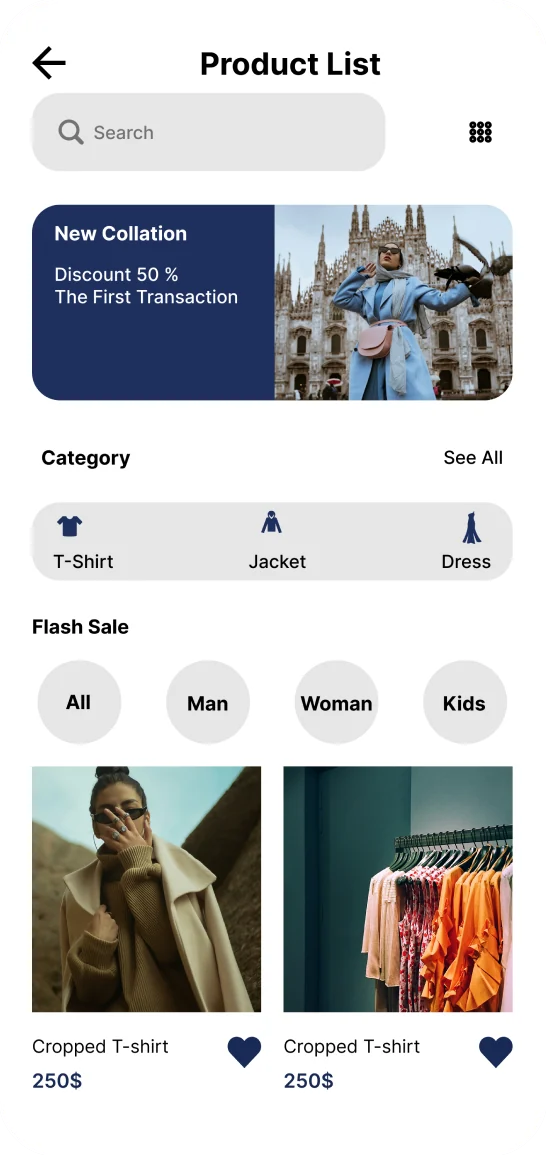
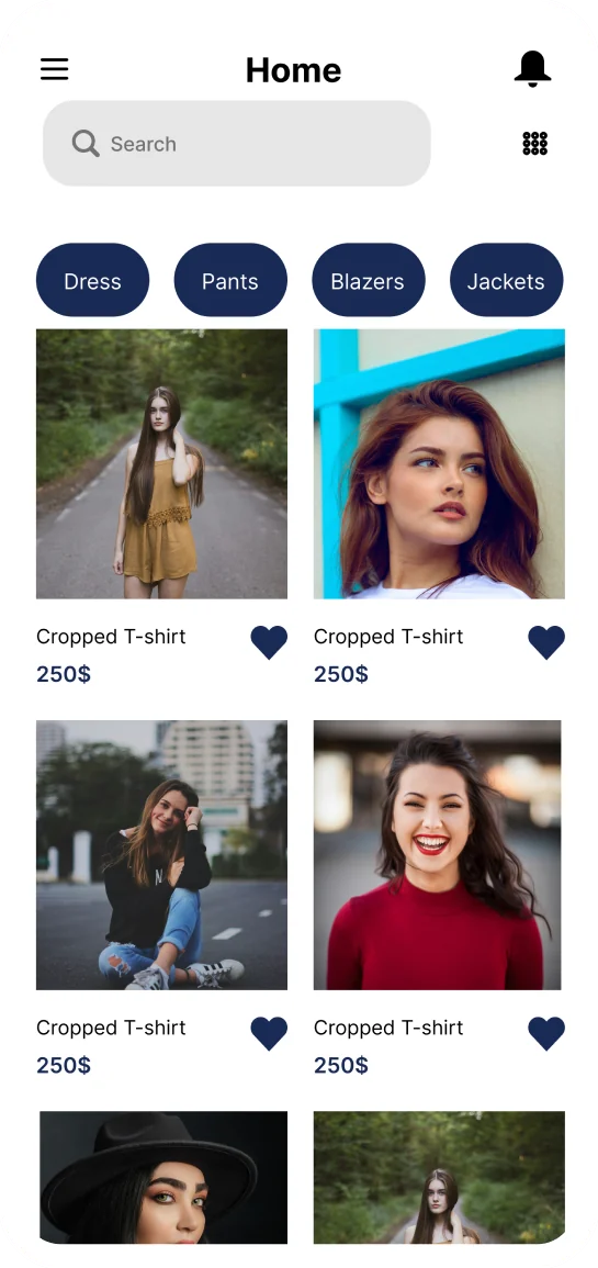
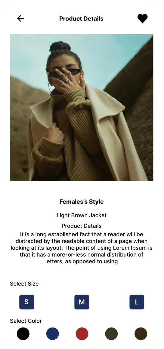
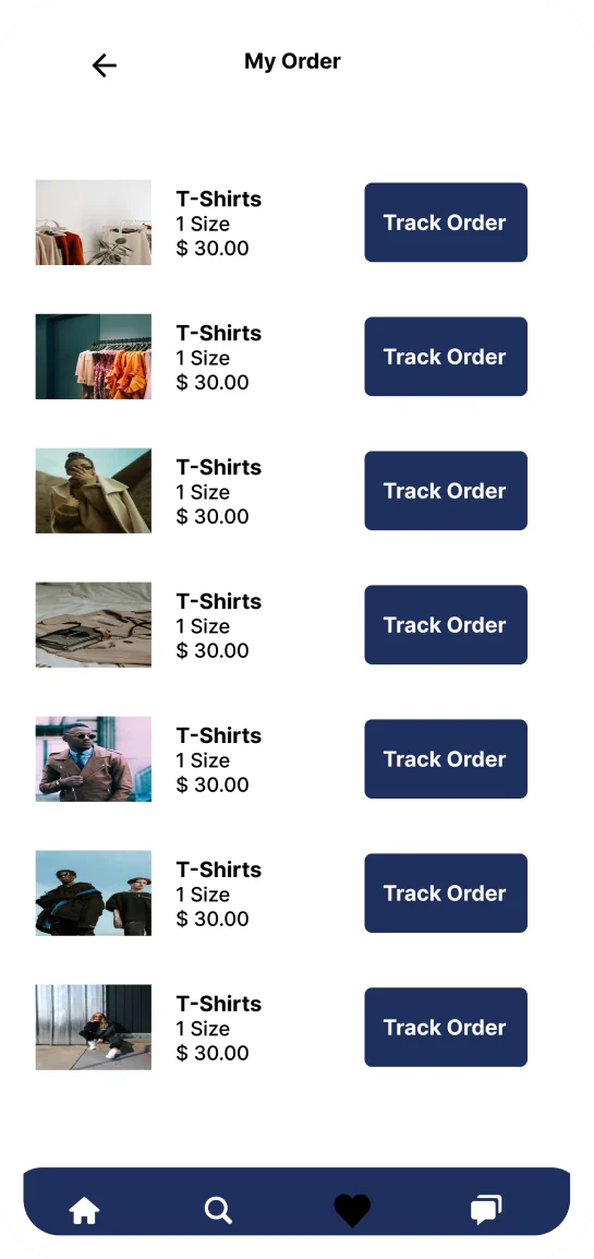
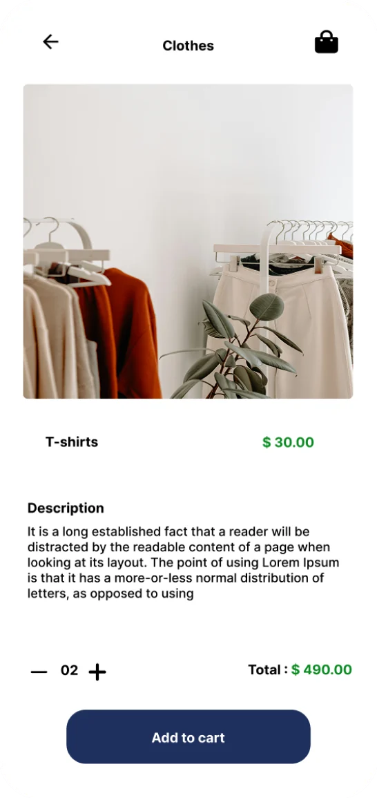
A concept app for men’s, women’s and kids’ fashion — with complete product details, sizes, colors, prices, live offers and flexible payment methods in one place.
Shoppers worry about late deliveries and clothes that don’t match what they saw in the app. Categories can be confusing, and feedback rarely leads to visible improvements.
Faster ordering, clear categories, detailed product pages and an open feedback loop — every review, positive or negative, feeds the next improvement.
User interviews, user research, competitive analysis
Persona, empathy map, journey map
User flow
Wireframes, design system, visual design
Usability testing
Benchmarking Noon, Amazon and Shein showed that reviews, offers and payment options are table stakes. The real opportunities were fashion specialization, delivery speed and credibility.
| Criteria | Noon | Amazon | Shein | H&M concept |
|---|---|---|---|---|
| Reviews | Strong | Strong | Strong | Strong |
| Offers | Strong | Strong | Strong | Strong |
| Payment methods | Strong | Strong | Strong | Strong |
| Installments | Strong | Strong | Gap | Strong |
| Specialization | Gap | Gap | Strong | Strong |
| Usability | Strong | Strong | Strong | Strong |
| Delivery speed | Gap | Gap | Gap | Strong |
| Credibility | Gap | Gap | Strong | Strong |

“Style-savvy guy who loves finding the perfect fit — one scroll at a time. Always on the hunt for fresh looks and wardrobe upgrades.”
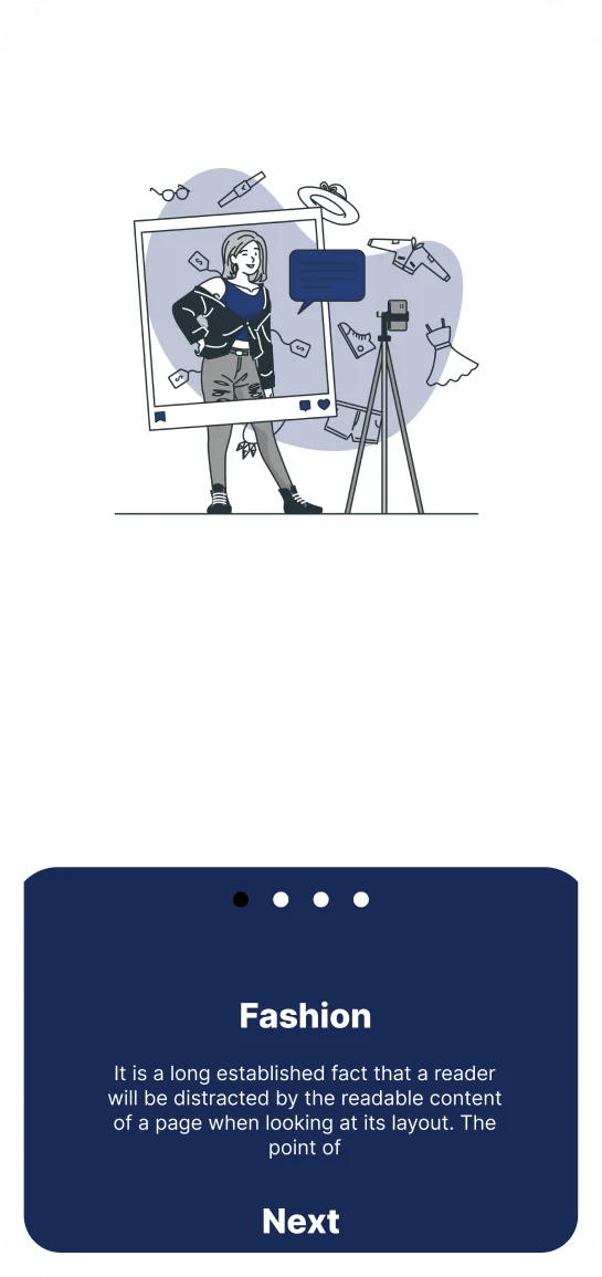
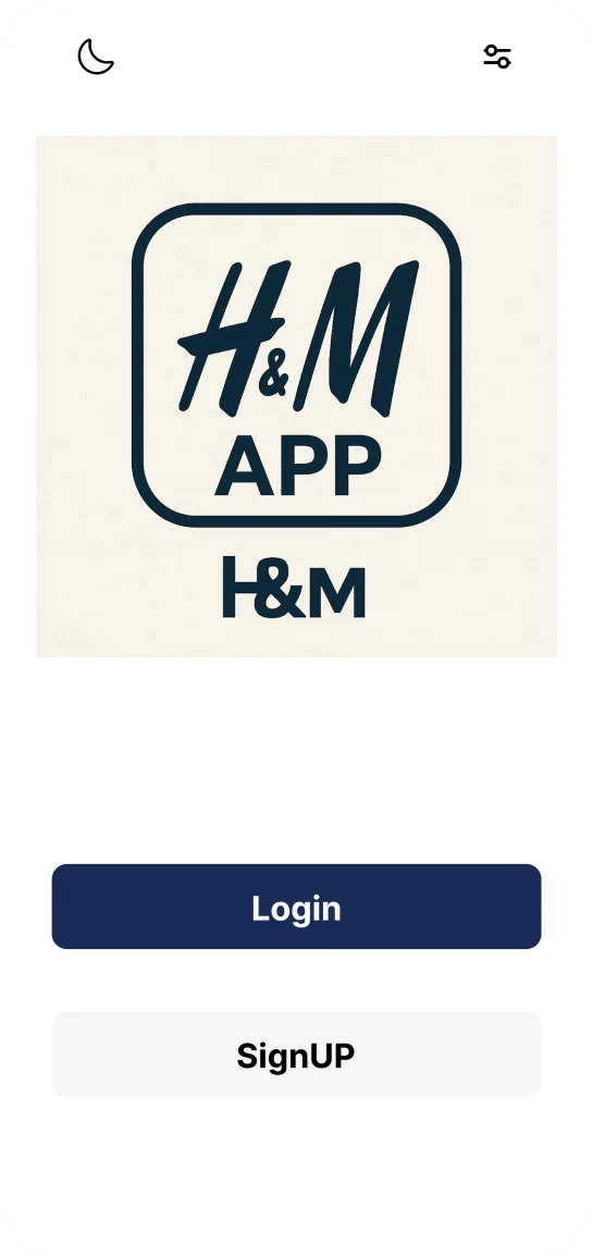
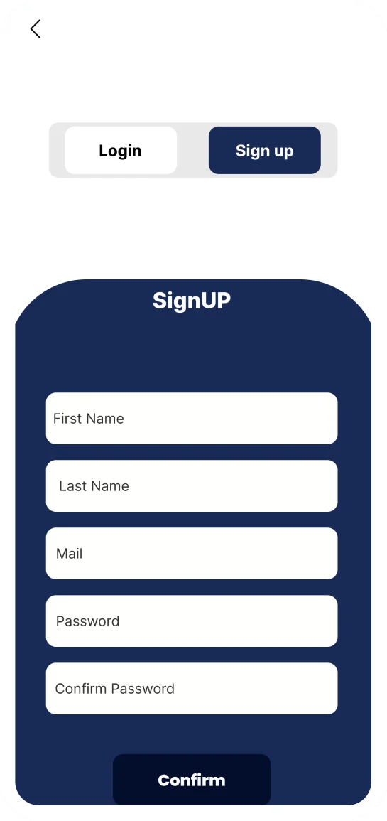
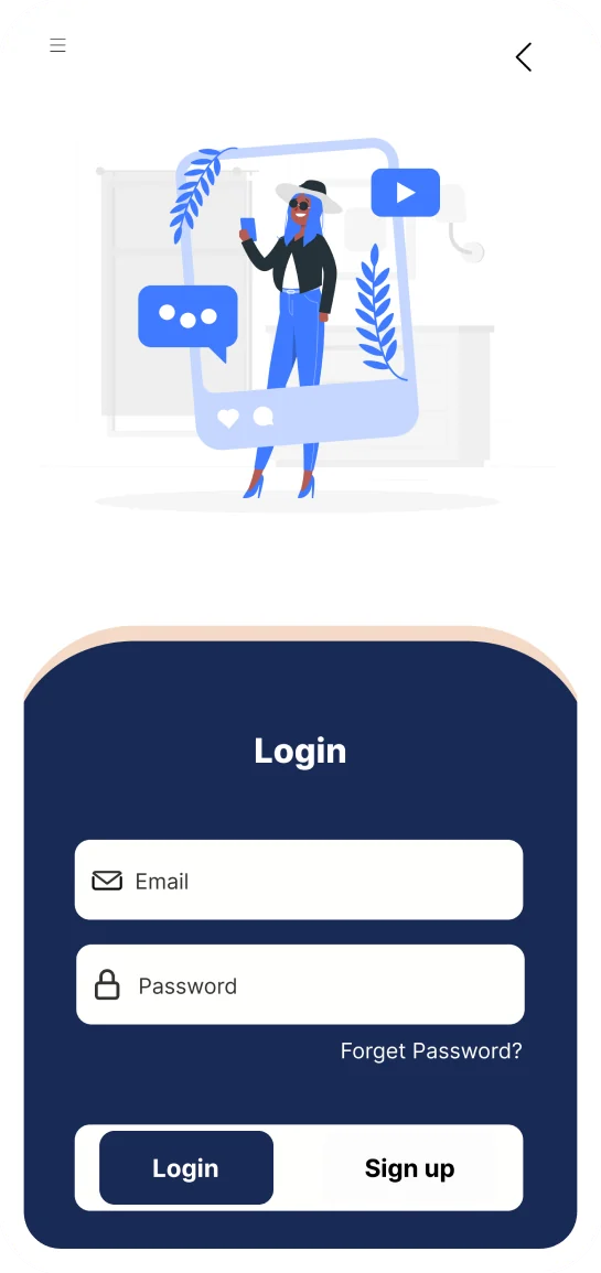
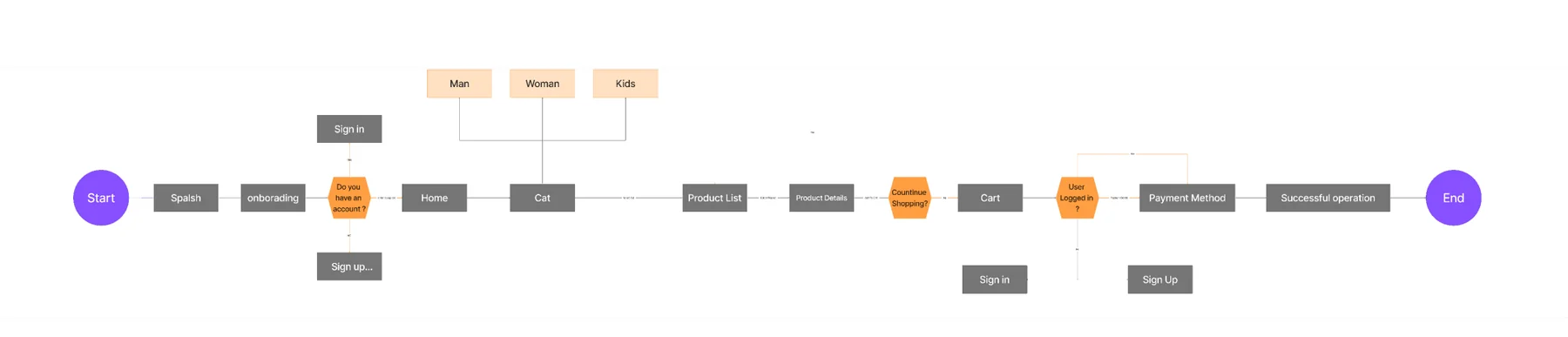
The user flow runs from splash and onboarding through sign-in or sign-up, home, category and product list, product details, cart and payment — with category branches for men, women and kids.
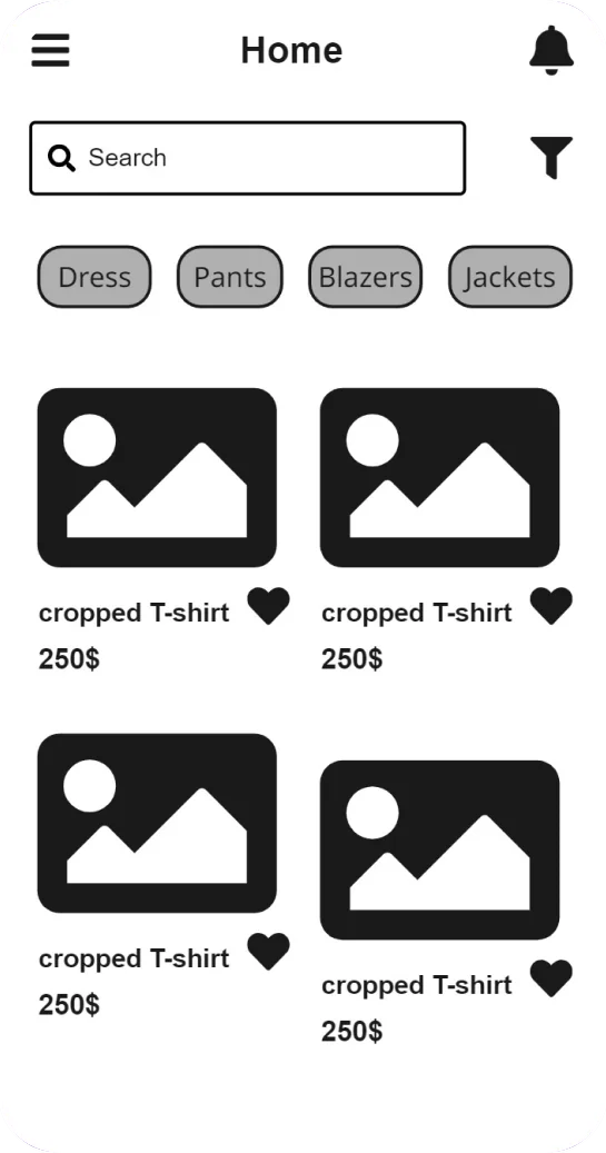
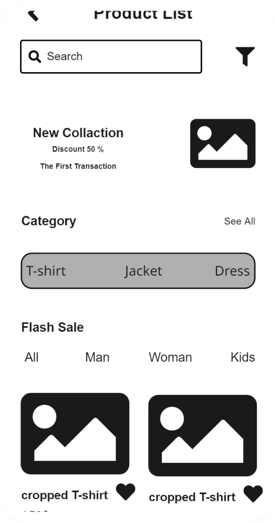
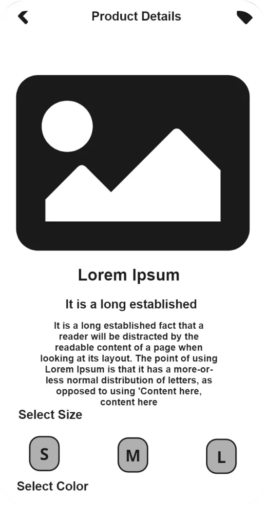
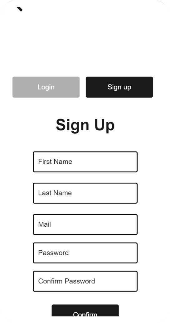
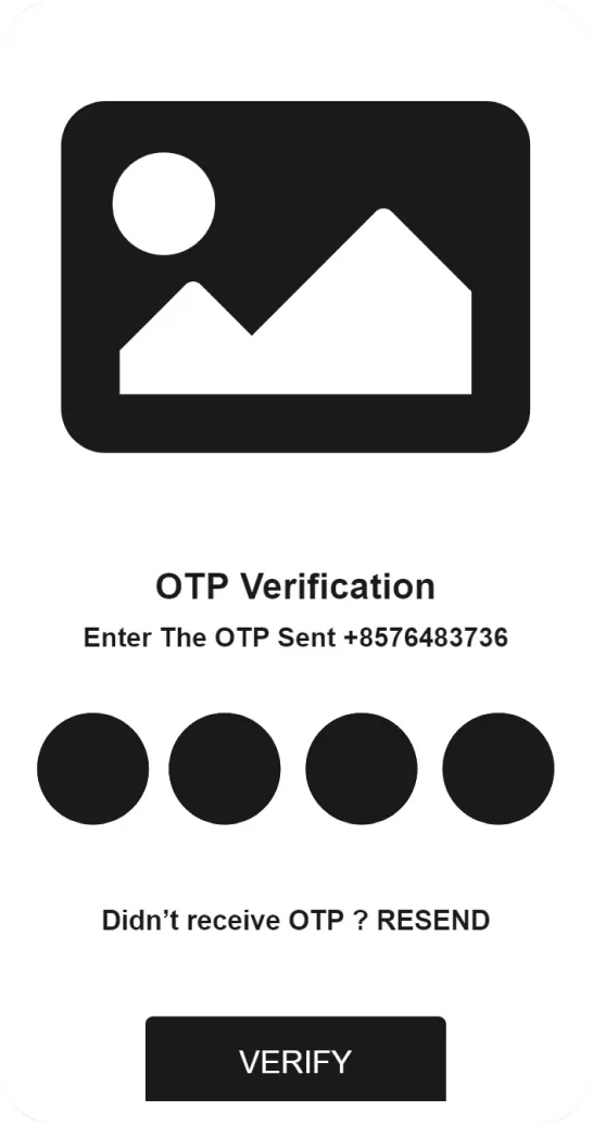
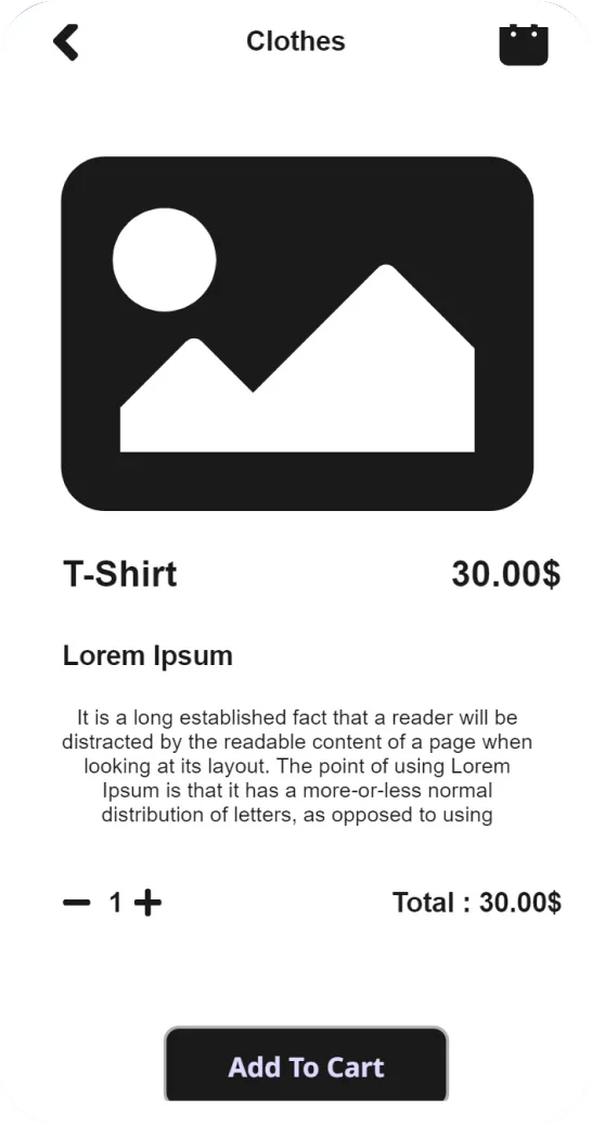
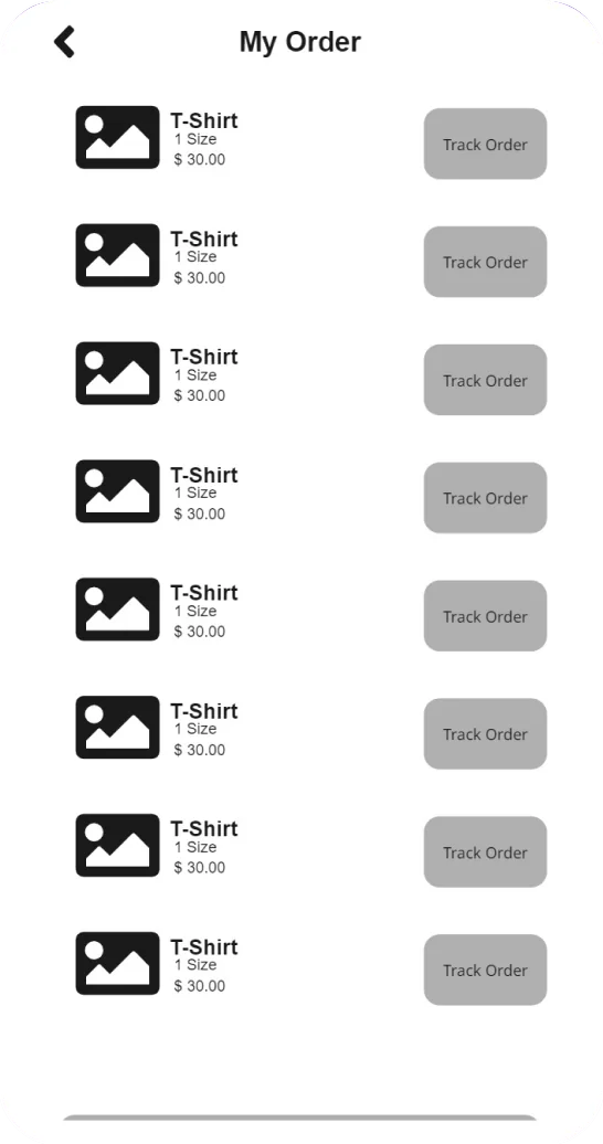
Grayscale wireframes locked in layout and hierarchy before any color or imagery was added — then each screen was refined into the final UI.
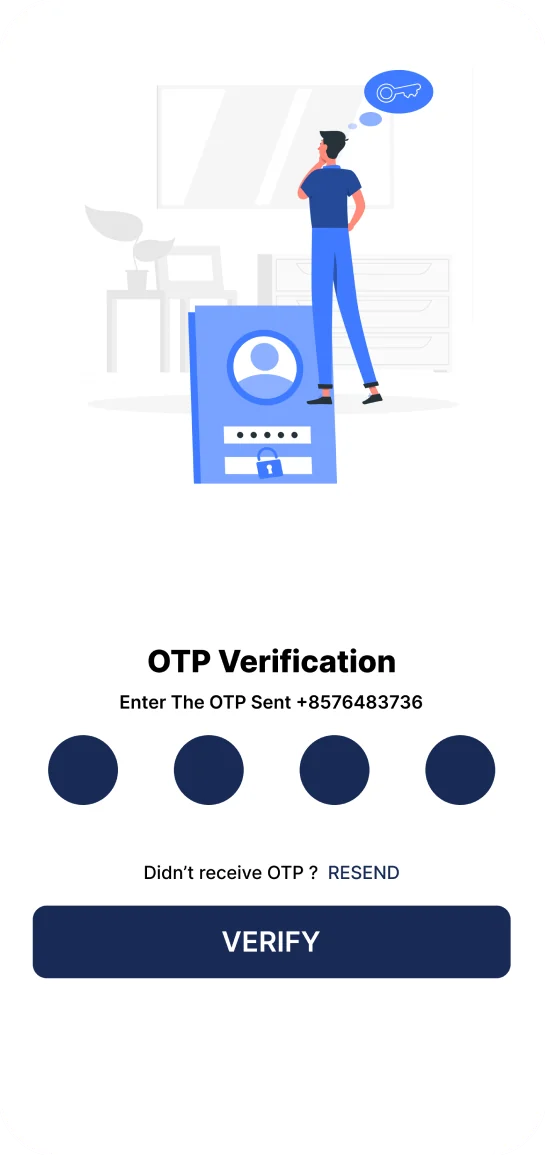
A deep navy anchors every action and black carries the type, leaving product photography to provide the color. Soft line illustrations add warmth to onboarding and authentication. Tip: click a swatch to copy its hex.